


Are you at the finish line of developing your awesome game? Yes? So that’s a perfect time to start thinking about an icon. With this post you’ll learn how to design a great icon for a mobile game. Let’s start!
First impressions matter. Whether on a job interview, while meeting new people or, like in our case, in the game stores. And what usually makes the first impression there? Icon.
Icon is the most noticeable element that people see first while searching through the stores. Future players have to click this small image in order to get into your game page, learn more about it and then download it. In the best possible scenario, an icon will be enough for them to download the game immediately. So it just has to catch people’s attention.
“Your icon is the first opportunity to communicate, at a glance, your app’s purpose.” – Apple
Good advices on designing an icon
Think about what your game is about and how you can represent it visually in one, small square. Less is more, so try to avoid too many elements on it, don’t overwhelm potential users. Try to use only one symbol and provide a single focus point. Use high-contrasting colors which will make your game icon pop.
Also, don’t use the actual game name on the icon – on mobile devices they can be very hard to read.
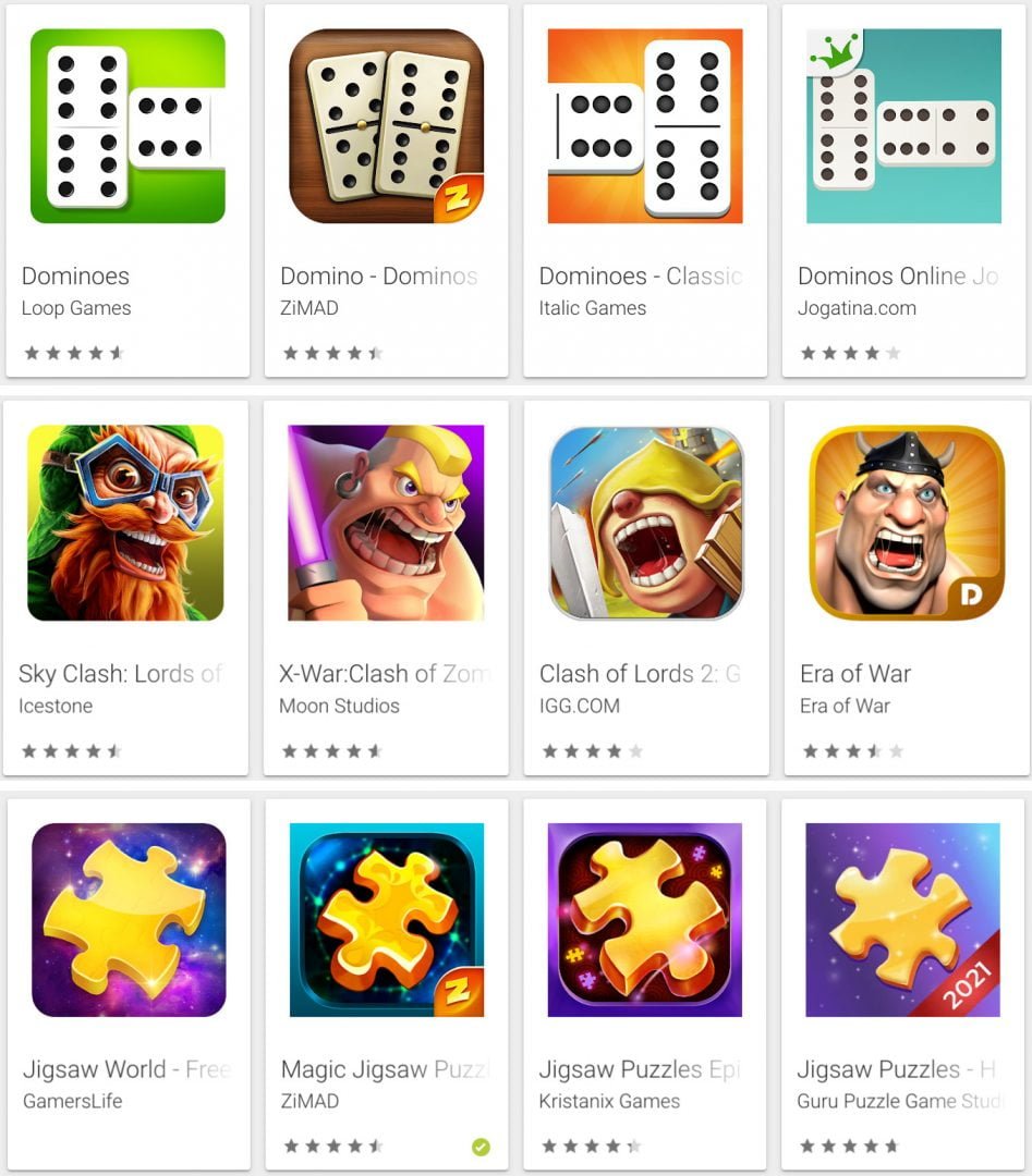
And the most obvious in the end. If you want to stand out of the crowd or just not get lost in it: be original, unique and don’t copy icons from others!
Technical specification for icons
Each store has its own requirements but to keep it short, when making an icon stick to 1024×1024, non-transparent PNGs. It’ll make your life easier as you can always downscale without quality loss when you need it, and you don’t need to worry about transparency at all.
You can find detailed specifications for each store at the following links:
Icons A/B testing
Also, don’t forget about A/B testing for icon variations. The easiest way to do this is to use “Store Listing Experiments” in Google Play Console. Drive half of your traffic to option A, and the other half to option B and see which version performed better. This will give you a pretty good idea of which icon design is more attractive to users. Remember that you need a sample of enough size to tell if the results are accurate. Also remember that what works on the Play Store will not necessarily work on the App Store.

Summing up
Now you know how to design a great icon for a mobile game. Remember that creating a great game icon should be your priority. Use guidelines, create an icon that is related to your game and stands out from the crowd of your competitors.
